Website design · Visual identity
Cinnamon.
Website and brand concept for an AI property platform.
01 · Brief & contribution
Designing for a proposed rebrand
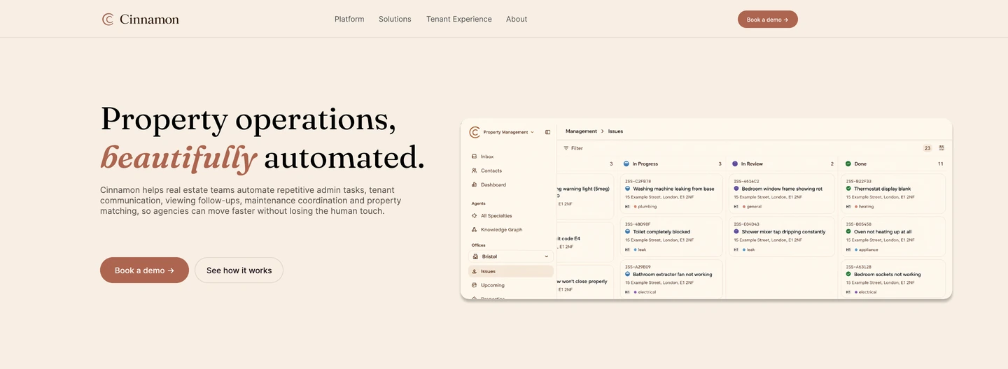
Letty invited me to explore its proposed rebrand to Cinnamon as part of an application for a UX/UI & Digital Designer role. The product remained an AI platform supporting real-estate agency operations and tenant communication; the brief asked for a new homepage and visual identity.
I designed the desktop homepage, logo and wordmark, colour palette, typography and supporting button and card styles in Figma. I used GPT for inspiration and style ideas, then constructed the designs myself in Figma.
02 · Visual identity
Colour, typography and interface styles
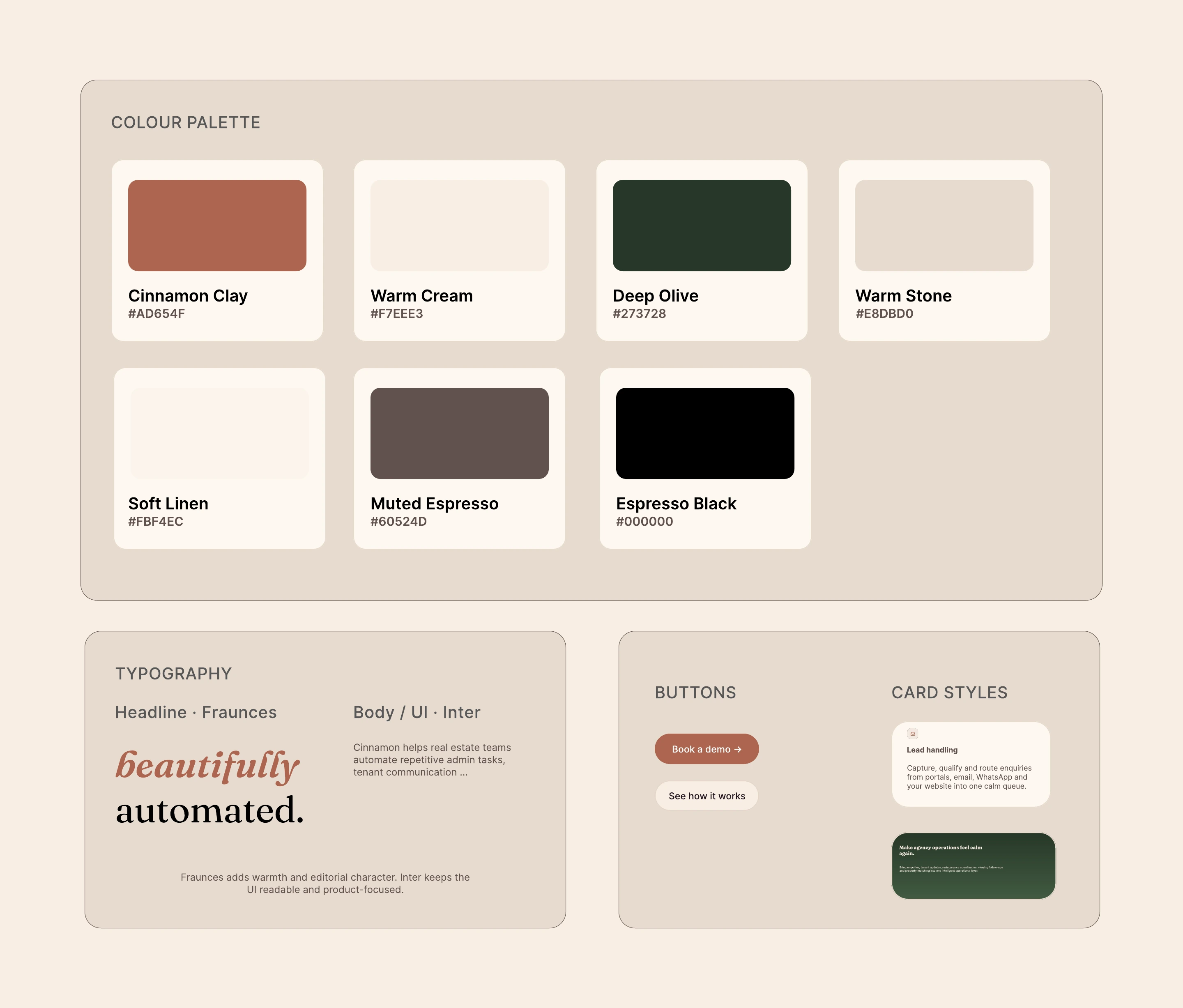
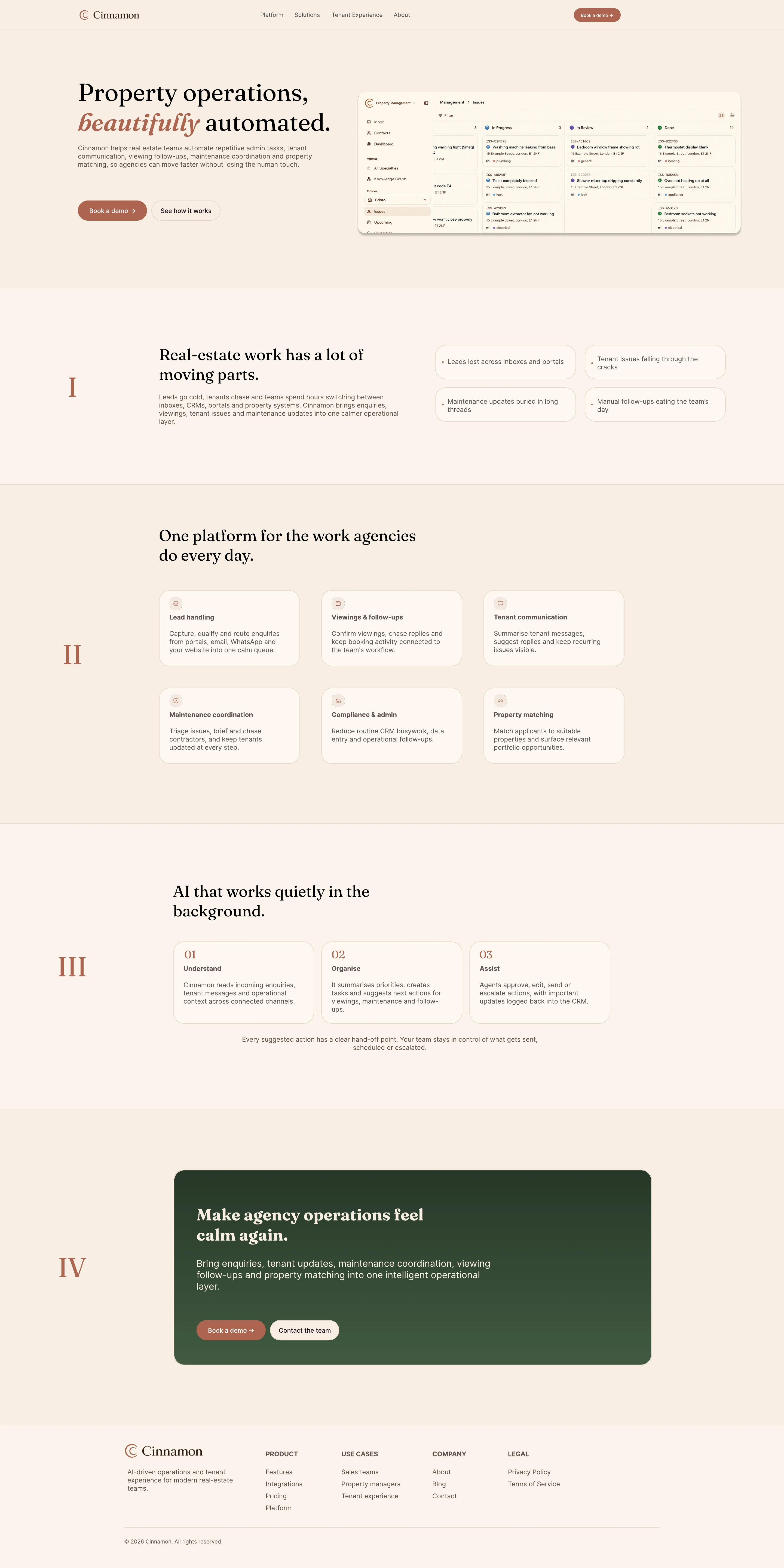
I chose cream backgrounds, cinnamon accents and deep olive sections to give the product a warmer visual identity. I applied the same palette and typography across the homepage, buttons, cards and illustrative product UI.
- Palette
- Cream and linen form the page backgrounds, cinnamon identifies primary actions, and deep olive distinguishes the closing call to action.
- Typography
- Fraunces gives the headings their editorial character. Inter is used for body text and interface labels.
- Consistent UI styling
- Primary and secondary buttons, feature cards and the closing panel share a visual treatment. The style guide records these choices for the concept.
03 · Homepage & product visual
Explaining the product and its capabilities
I organised the homepage around the problems agencies manage, the platform’s capabilities and a three-stage explanation of how it works: Understand, Organise and Assist. The page retains the product’s emphasis on staff approving, editing or escalating suggested actions.
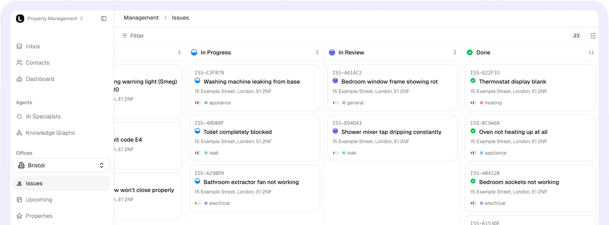
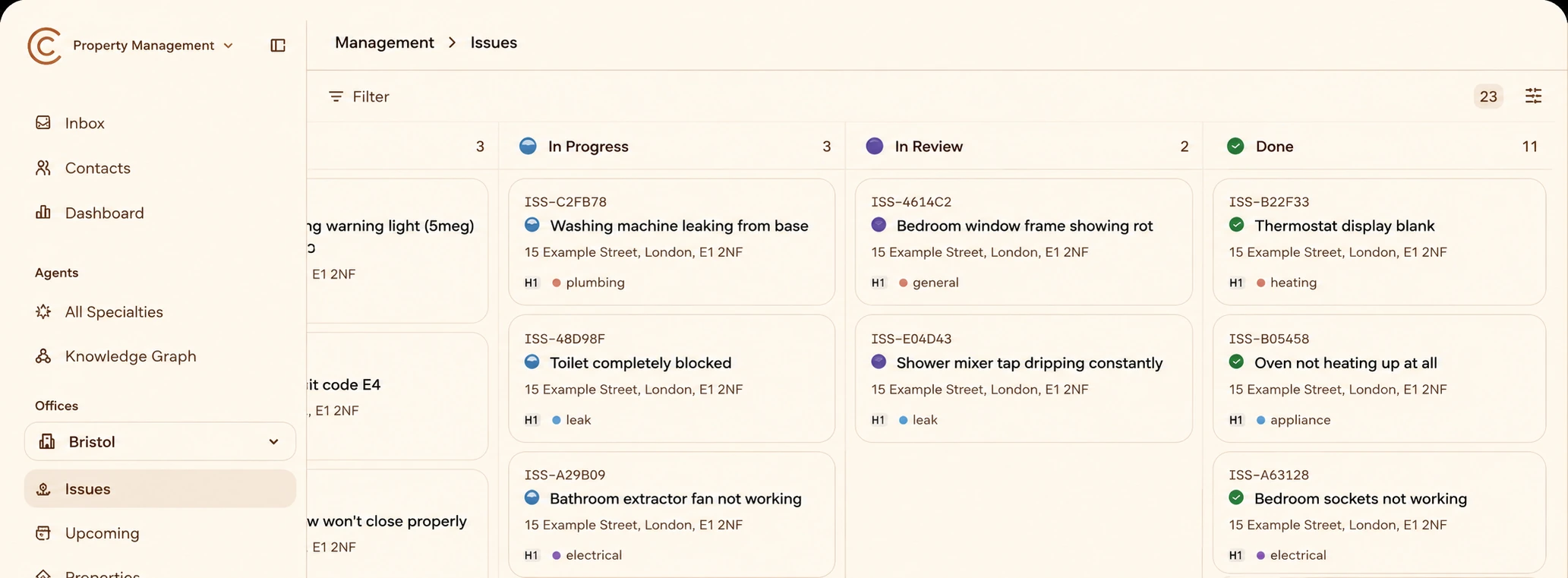
For the product visual, I restyled Letty’s existing dashboard with the Cinnamon colours and branding. The underlying layout and workflow came from Letty; my contribution here was the visual treatment. The interface details are illustrative examples, not a definitive product specification.
View the complete desktop homepage (1)
04 · Outcome & next steps
Submitted concept and further development
I submitted the concept as a Figma file and PDF. Letty acknowledged the submission and later paused recruitment because of other business priorities.
Before developing the concept further, I would refine small text and button contrast, produce mobile layouts and test whether prospective customers can understand the product and find the appropriate next action.
This was a recruitment design exercise. The warmer visual direction was a design intention; I did not measure its effect on trust, usability or conversions.